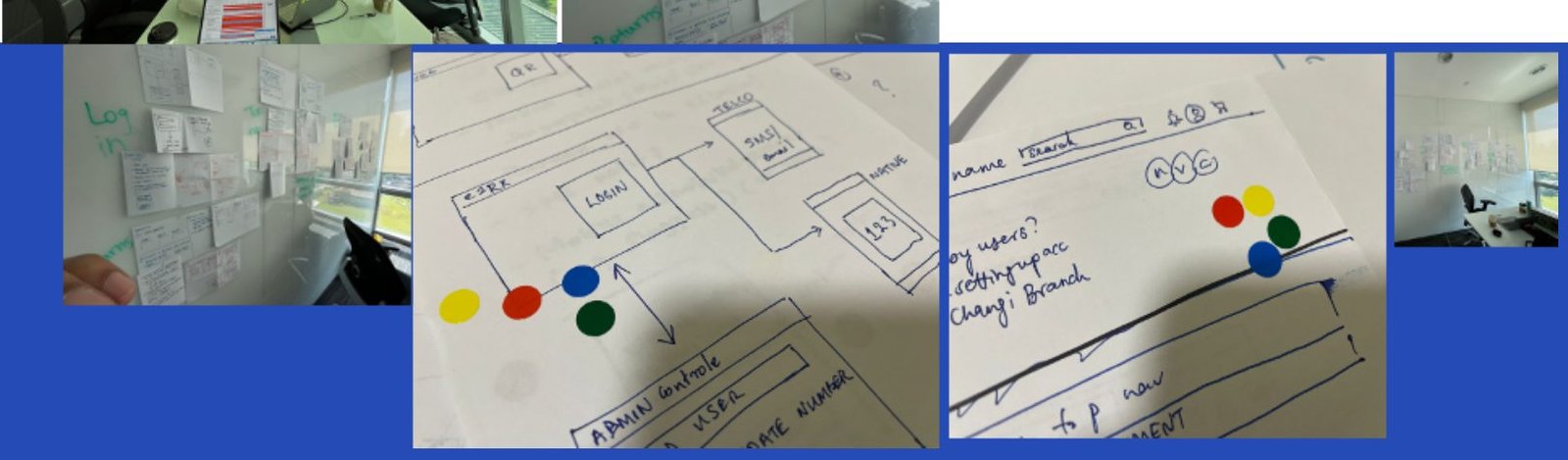
High Level Journey Case Study

Case study · eZRx at Zuellig Pharma · 2022–2026

From a single-page order form to Southeast Asia’s pharma commerce platform

Customers rated eZRx at an NPS of −36 when I joined. Four years of research, regional service design and a single design system later, they rate it +46, and seven times more order value flows through it every month.

−36
NPS, 2021
eZRx 4.0
+46
NPS, 2026
eZRx Plus
My role
Design lead → Principal product designer & senior PM
Scope
Order, payment, returns, rebate, loyalty and admin products
Reach
11 markets across Southeast Asia and Greater China
Team
Up to 14 UI/UX designers across in-house and agency

The starting point

eZRx 4.0 was an order form, not a commerce platform

eZRx is how hospitals, clinics, pharmacies and wholesalers across the region order medicines from Zuellig Pharma. In 2021 it did one thing: capture an order.

The product had grown around basic transaction fulfilment. Customers struggled with login friction, thin product information and an order status they couldn’t trust, so many simply called a sales rep instead. Digital adoption sat at 24%, and the business wanted a self-service channel that could work in every market.

What the business asked for

11 markets, one product

Grow from a handful of digital markets to eleven, without building a separate product for each.

Adoption and revenue

Raise customer adoption past 60% and move more of the region’s revenue through the digital channel.

Payments and returns online

Bring two offline modules into the platform so every operation lives in one system.

A marketplace

Extend ordering to support SME businesses and seller-side fulfilment.

Who uses it

Sales reps

Internal and external reps who place orders on customers’ behalf and need to move fast.

InternalExternal

Customers

Very different buyers, with order volumes from a few items a month to full wholesale.

Government and private hospitalsClinicsChain and retail pharmaciesWholesalers

The diagnosis

The problem was bigger than a UI redesign

A −36 NPS told us customers were unhappy. It didn’t tell us why. So before touching a screen, we went looking for the cause.

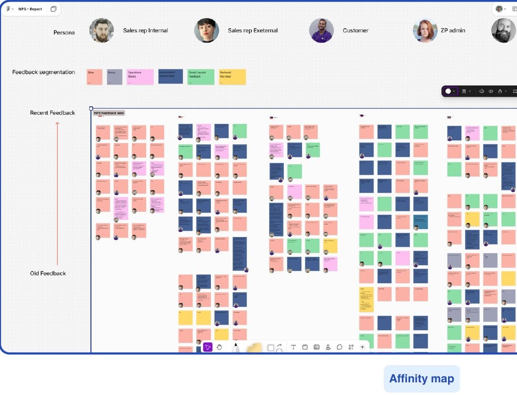
We took the 502 open-ended comments behind the NPS score and affinity-mapped them into themes. In parallel, a 462-person survey asked one focused question: what information do you need most when you place an order?

Digital affinity map with hundreds of colour-coded sticky notes grouping NPS feedback by persona
Affinity map of 502 NPS comments, segmented by persona: internal reps, external reps, customers and admins.

What customers complained about

NPS comments per theme, from 502 open-ended responses

What customers need to see before ordering

% of 462 survey respondents rating it most valuable

Two findings shaped everything that followed. Speed and downtime dominated the complaints, so this was partly an engineering problem, not only a design one. And the information customers wanted (expiry date, SKU-level name, pack size) was clinical and logistical, not marketing. Pharma procurement behaves differently from a generic shopping flow.

Talking to market teams surfaced four structural forces on top of that:

11 different markets

Each with its own regulations and operating model, and market admins with no flexibility to adapt the product.

Unexplored behaviour

Roles, behaviours and jobs-to-be-done varied by market, and in some markets had never been studied.

Different operations

Fulfilment branches and payment options differed, with no regional approach tying them together.

Need to scale

Configuration had to replace rebuilding the product for every new market.

eZRx 4.0 to eZRx Plus

We validated the future before scaling it

Rather than commit eleven markets to a redesign, we built a B2B commerce proof of concept to test one question: can a modern e-commerce experience support how pharmaceutical buyers actually purchase?

The work was organised around behaviour, role and job-to-be-done, not around screens. That meant aligning developers, market stakeholders and SAP use cases before a single pixel was finalised.

Service blueprintsJourney alignmentStakeholder alignmentMarket requirementsDev alignmentPrioritisationFeature phasingCrazy 8 UI workshopsPrototypesUser testingNew design systemAgency management

Blueprints at two altitudes

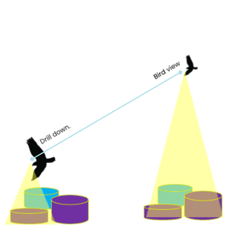
I built service blueprints with a bird’s-eye view for regional alignment and drill-down versions for micro-level decisions. They became the shared map that let market teams, developers and SAP specialists argue about the same thing.

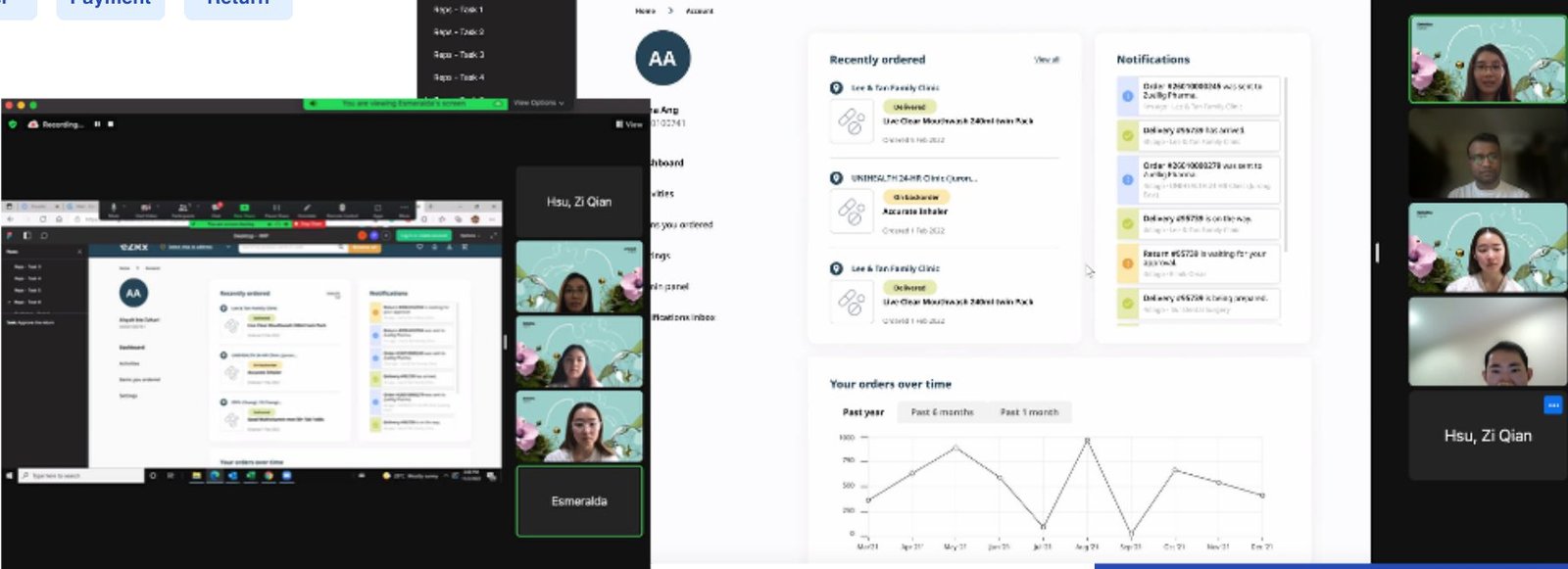
Drill-down service blueprint showing return approval, sales order and RO creation swimlanes
Drill-down blueprint covering sales-order, return-request and client-approval flows.

Twelve weeks, before the AI era

I recruited six UI/UX designers from Deloitte for a three-month sprint focused on the three flows that mattered most: order, payment and return. Every week had a job.

Prototyping~1 month · new brand design system
User testing3 weeks · 13 users, 2 pilot markets
Iterate2 weeks · workshops, documentation

Bar widths are proportional to time spent.

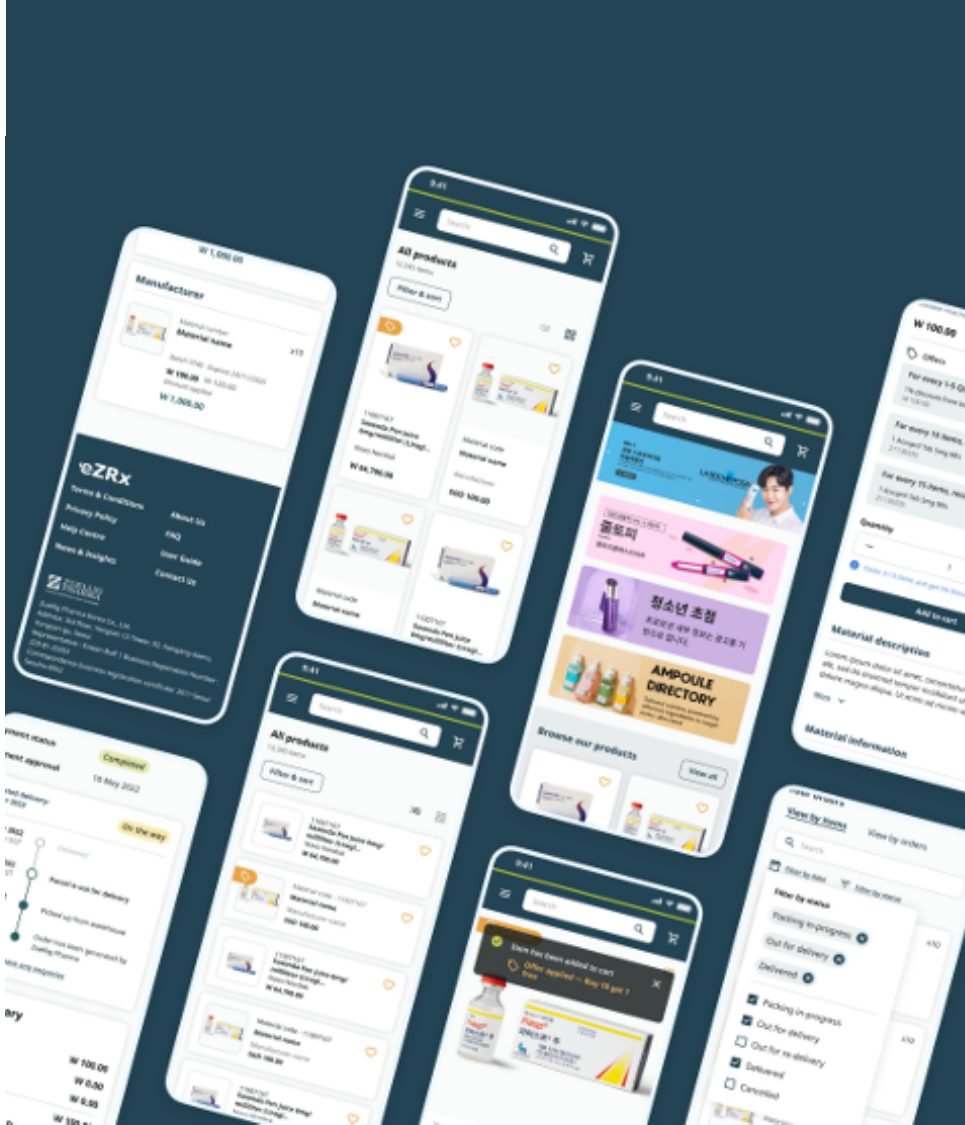
Grid of mobile prototype screens for eZRx Plus
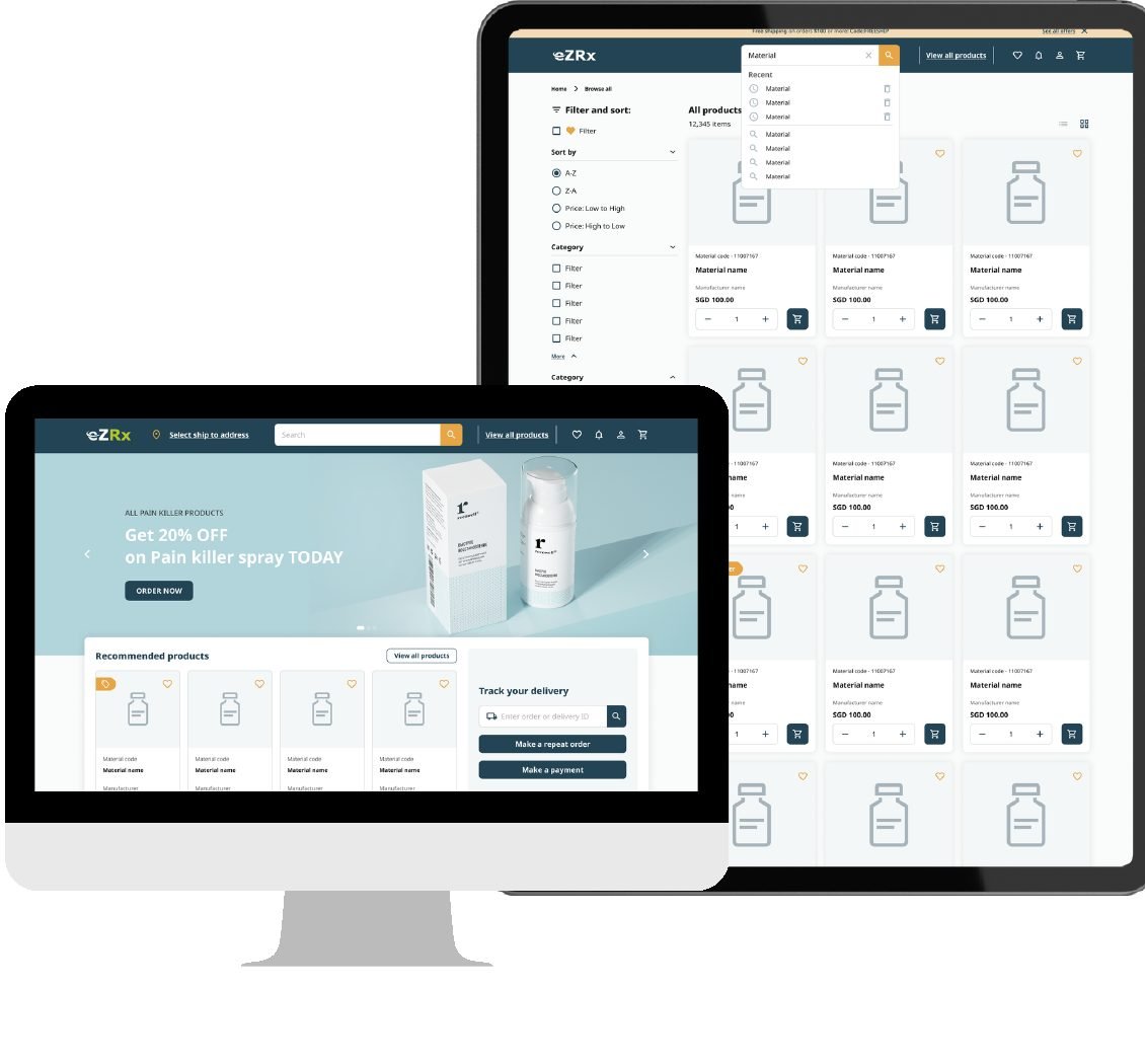
eZRx Plus prototype shown on desktop and tablet
Remote user testing sessions with sales reps and customers over video call
Moderated testing with sales reps and customers from the two pilot markets the business prioritised.
72.5
System Usability Scale score, out of 100
13
Reps and customers tested
3
Core flows: order, payment, return

The scores were good. The quotes were more useful, because they told us what “good” still left out.

“It’s sophisticated. I think it’s much better than the previous one, in terms of the look and everything. The notifications and statuses are good. You just need to speed up the portal.”Sales rep, Malaysia
“The ‘Items You Ordered’ page is useful for my year-end audit. I wouldn’t have to call the hotline as info is readily available on the portal.”Customer, Singapore
“So far so good, just that sometimes it feels like I have to click on a lot of things. But overall it’s alright.”Sales rep, Malaysia
“There are a lot of new features, very interesting and helpful, but maybe not for my finance team. You want my finance to log in to your system? I don’t think they’ll do it.”Customer, Malaysia

That last quote stuck with me. Adoption doesn’t depend only on the person placing the order; it depends on everyone in the customer’s organisation who touches it.

Scaling across the region

Malaysia and Singapore proved it. Then nine(9) markets shaped it.

eZRx Plus launched in Malaysia and Singapore as pilots. As it expanded, the in-house team I led took over from the agency and the work shifted from “does this work?” to “does this work here?”

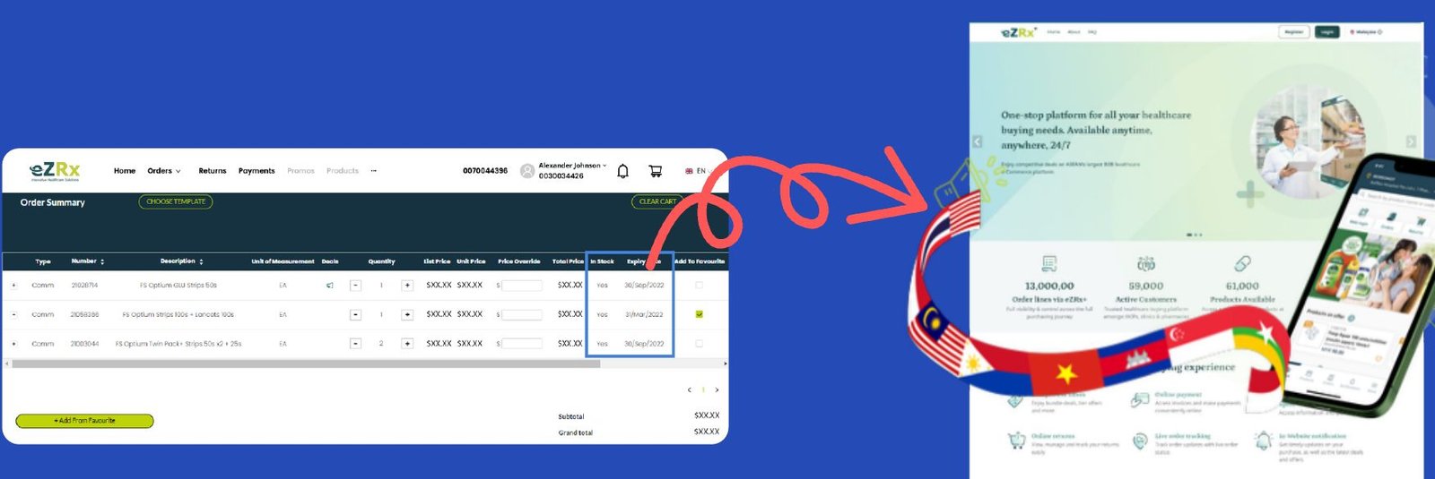
Before: a dense single-page order table. After: eZRx Plus web and mobile storefront
Left: the eZRx 4.0 single-page order entry. Right: eZRx Plus, rolled out market by market.

Mapping how each market actually operates

Payments and returns had never been online, and every market ran them differently. Before designing them, I mapped the real service operations end to end, down to the bank responses and warehouse handovers.

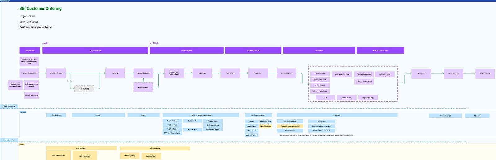
Service blueprint for the customer order flow
Service blueprint for the order flow, from search to delivery and the systems behind each step.

87 users in 9 markets, in person User Testing Interviews

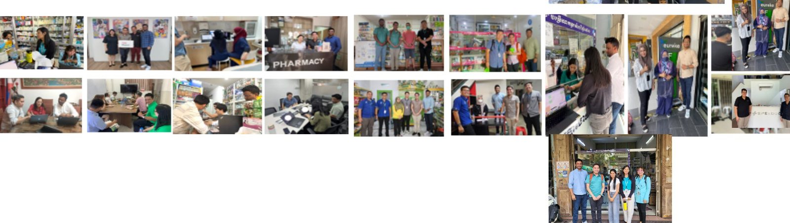
Remote testing had limits. We went into pharmacies, clinics and warehouses across nine markets and watched people order where they actually work.

Photo collage of in-person user testing sessions in pharmacies and clinics across nine markets
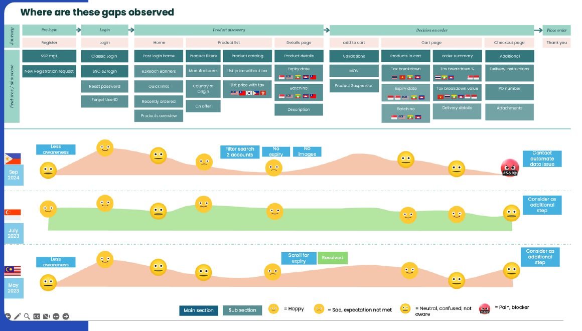
Value map of user testing feedback showing emotional highs and lows per market across the ordering journey
Findings plotted on a value map: where each market’s journey felt good, and where it broke down.

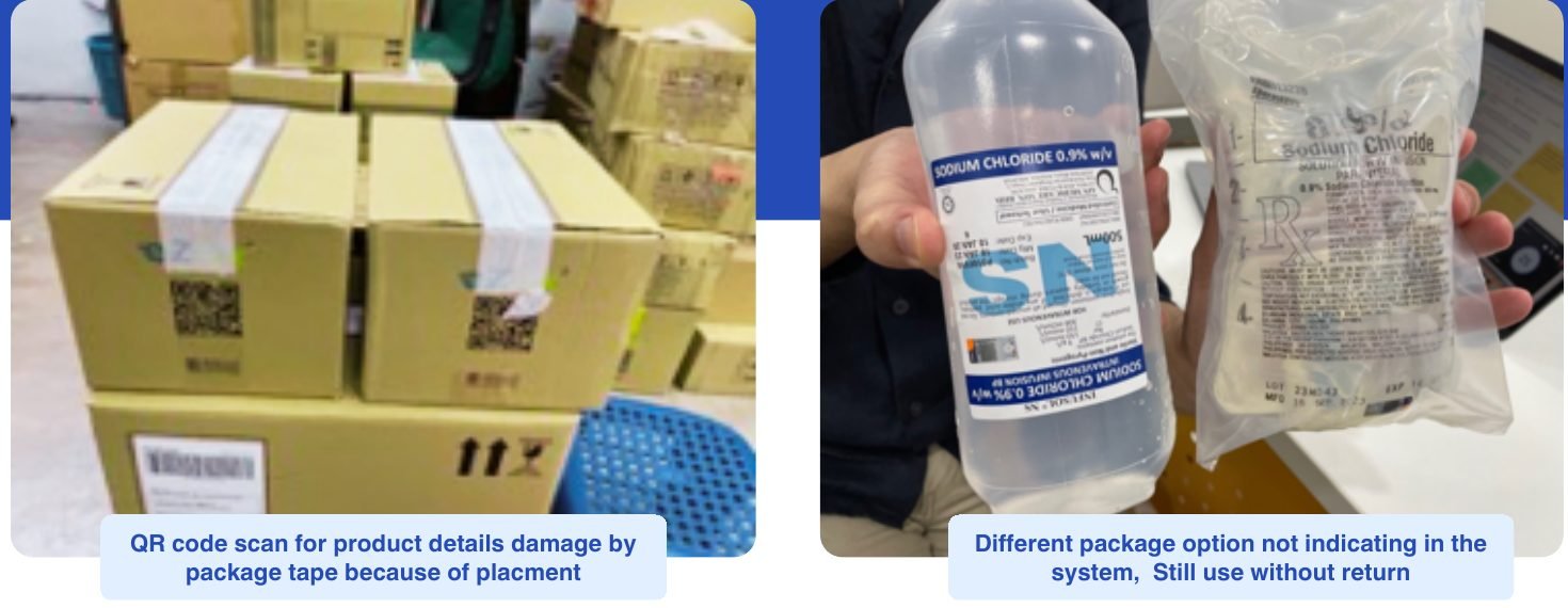
Some of the most important findings had nothing to do with the screen. Being on site showed us problems no prototype could.

Left: a QR code on a box covered by packing tape. Right: IV fluid packs whose package variant isn't shown in the system
Left: product QR codes were unscannable because packing tape covered them. Right: package variants weren’t reflected in the system, so customers kept stock they wanted to return.

From findings to priorities

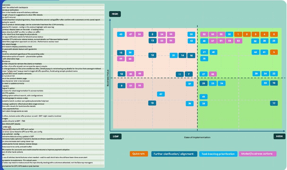
Prioritisation matrix plotting findings by impact and ease of implementation
Findings scored on impact against effort with market teams.
Crazy 8 sketches and team workshop photos
Crazy 8 workshops with the in-house team to turn the top findings into UI.

Letting data settle the debates

User testing raised hypotheses. I used Mixpanel to check them against real behaviour across all markets before we spent space on the screen.

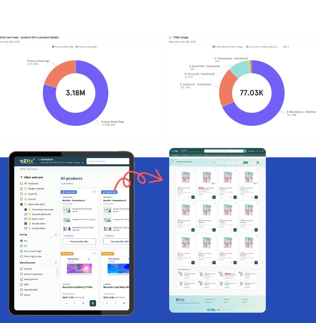
The filter nobody used

Testers rarely touched the product filter. Mixpanel confirmed it: across markets, filter usage was barely half the add-to-cart rate on the same page.

We made filtering a secondary interaction and gave the space back to product discovery.

Mixpanel charts and before and after product listing layouts

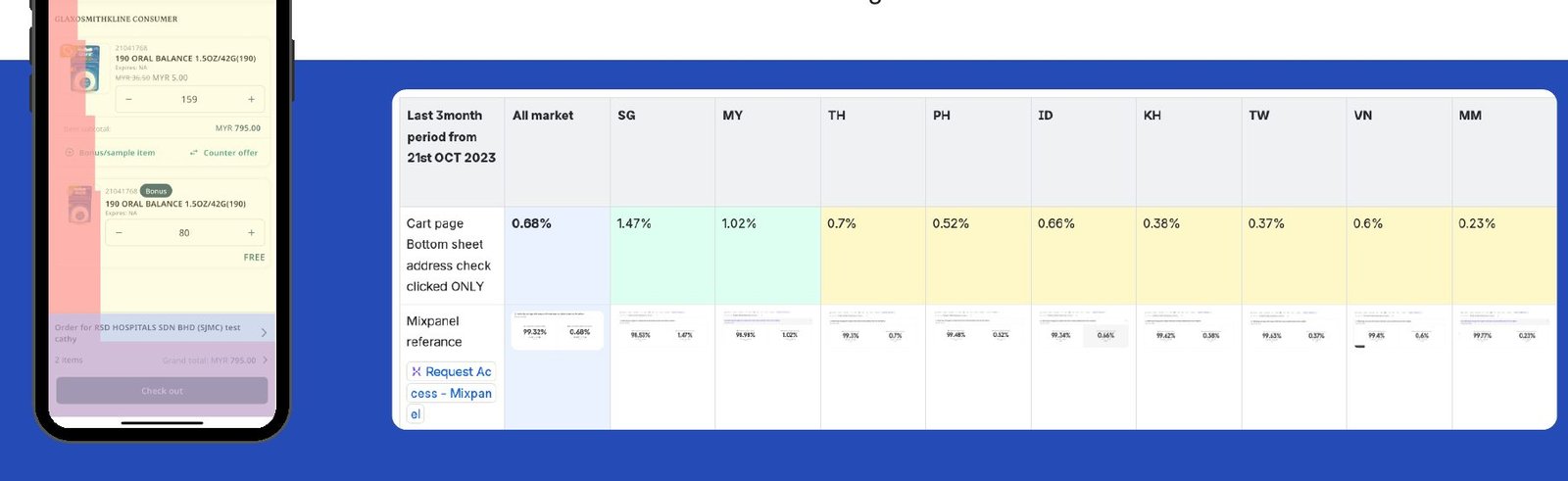
The delivery address check nobody did

Delivery address details sat in a bottom sheet on the cart page. Only 0.68% of users across the region opened it; even in Singapore and Malaysia it was 1–2%.

We moved the address inline and freed the space for one more product above the fold, reducing choice overload on the screen where people decide.

Cart bottom sheet and Mixpanel usage table by market

Designing for every market at once

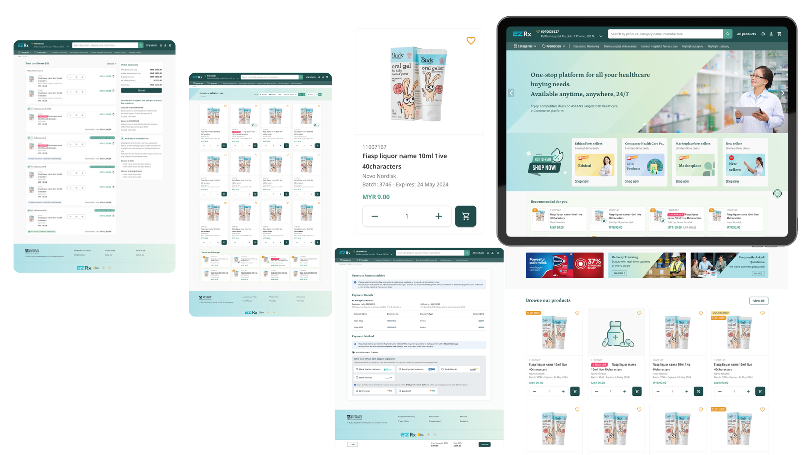
Scaling to eleven markets meant the details had to hold everywhere: multi-language UI, a three-step maximum for navigation, WCAG 2.0 AA contrast, consistent UX writing, and a chatbot conversation design so customers could ask for order totals or invoice status without calling anyone.

eZRx Plus web screens: product listing, product detail and checkout
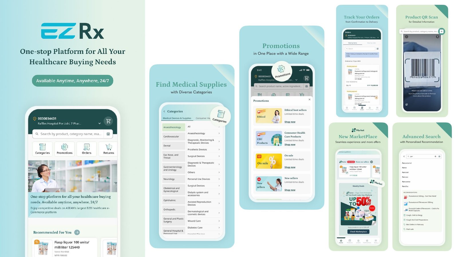
eZRx Plus mobile app screens: home, categories, promotions, order tracking, QR scan and marketplace
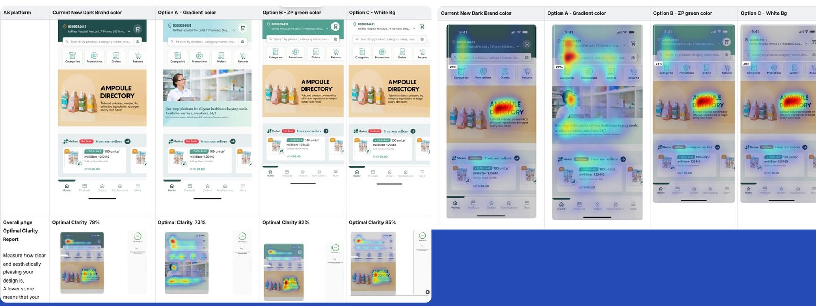
A/B attention heatmaps comparing four banner colour options
A/B attention heatmaps to choose the clearest brand banner treatment.
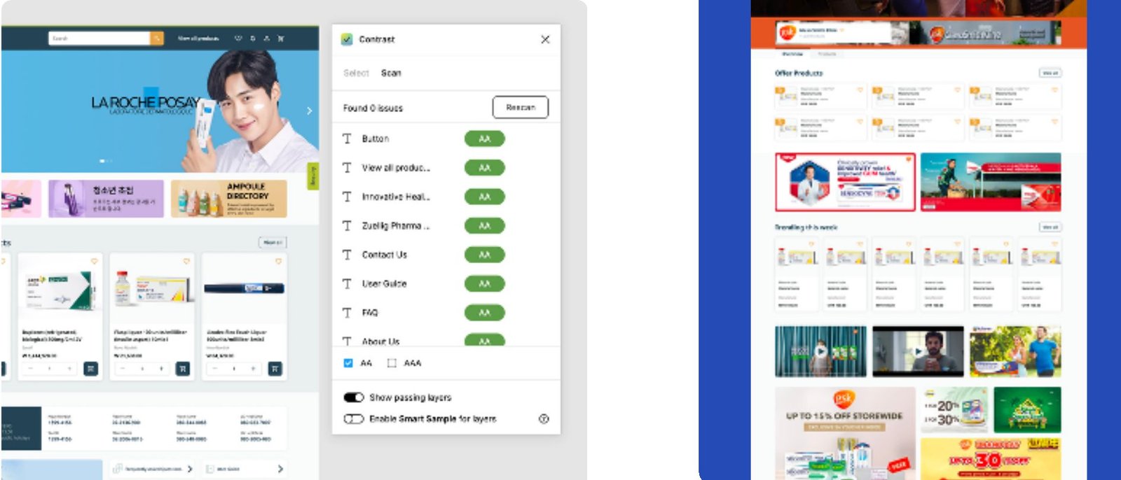
WCAG AA contrast check results alongside marketplace POC screens
WCAG 2.0 AA contrast checks, and the marketplace POC being tested.
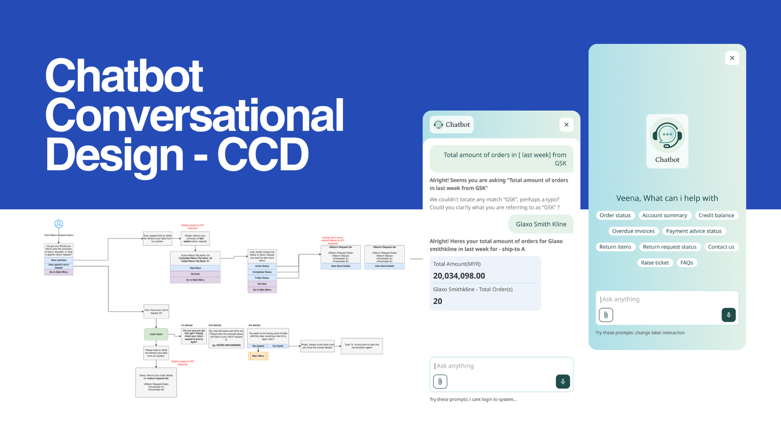
Chatbot conversation screens answering order total questions
Conversational design for the eZRx assistant.

Feature modules

Ordering was only one part of the relationship

A pharmacy or hospital doesn’t just order from Zuellig. It pays invoices, sends stock back, earns rewards and chases the best deal. These modules bring that whole commercial relationship into eZRx, so customers stop picking up the phone for it.

Payments

Settle invoices online, in full or in part, without matching payments by hand.

Previously offlineRegional Flow11 marketsBank Gateway Alignmetns

The problem

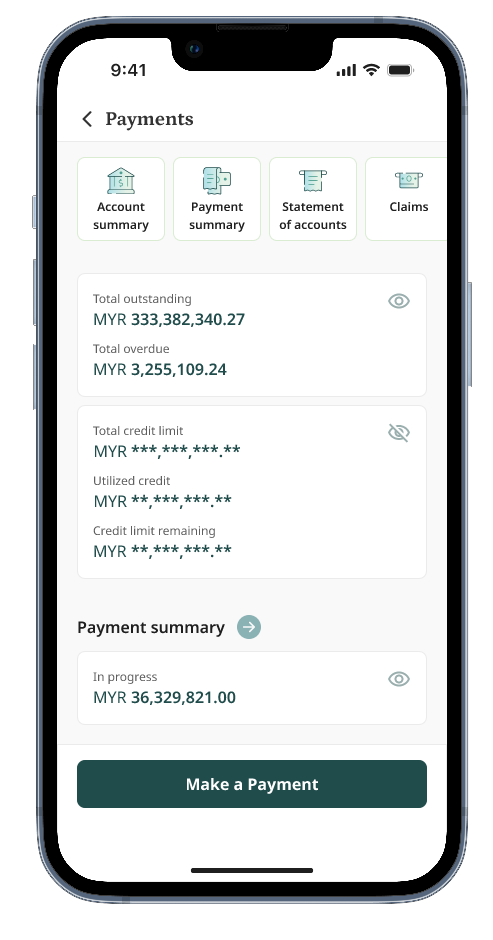
Payments happened outside eZRx, through offline channels that varied by market and by bank. Customers had no single place to see what they owed or what they had paid.Payment Collector Update delays, SAP sync with Statment of Accounts delays

Key decisions

  • Minimum effort for partial payments. Paying part of a balance had to take as little effort as paying all of it. I treated this as a hard constraint, not a nice-to-have.
  • Oldest-first auto-allocation. Customers enter the amount they want to pay and eZRx applies it to their oldest invoices first, so nobody matches payments to invoices line by line.
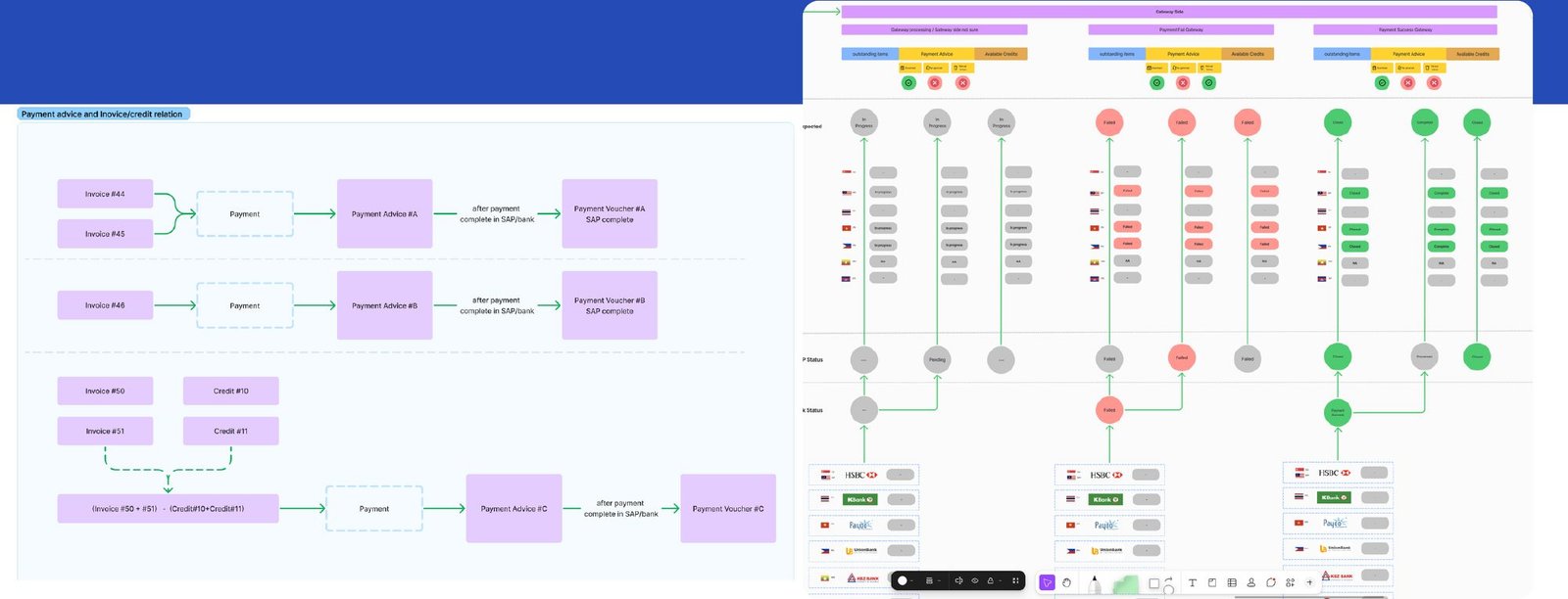
  • One status model across banks. I mapped payment advice statuses in every market against each bank’s responses, so customers see the same clear status wherever they are.
  • Virtual bank accounts support Specific Use case of ID marker virtual bank payment with time limitation for payment advice flow alignments
  • Payment advice generations Payment advice generation before payment for approval process support for end users internal process
  • Payment advice deletion controle Payment advice generation deletion control logic flow base on bank respons timing periods
  • Credit / G and R Tax deductions Offset Credit notes while new payment process with same principal validations
Payment advice status map across markets with bank responses
Payment advice statuses mapped per market against each bank’s response.

Alongside payments, I also worked on automated credit management and a proof of concept for AI-assisted credit checks on order release.
Returns

Request a return and get credit without calling a sales rep.

Previously offlineSAP workflowService designOperational Document reducing

The problem

Returns ran offline, across collection, warehouse inspection and credit teams who each saw only their own step. Customers couldn’t tell where a return stood.

Key decisions

  • Two ways in. A referenced flow starts from the invoice. An unreferenced flow starts from the product, so customers without the invoice to hand can still start a return.
  • Design the service, not just the screen. I mapped the full operation from return request to collection, warehouse inspection and credit note, so every status the customer sees matches a real step.
  • Fix what the field showed. In-person testing showed package variants weren’t in the system, so customers kept stock they wanted to send back.
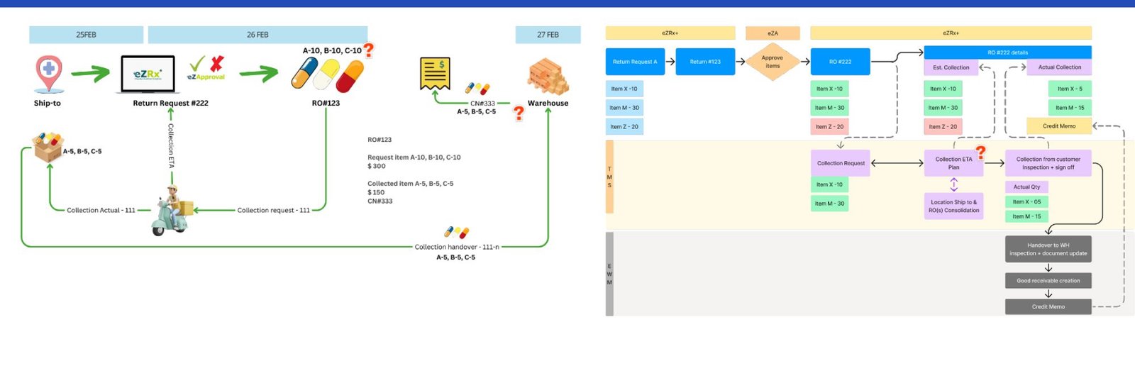
Service operation flow for returns and credit notes
Service operation flow for returns and credit.

Returns to principals followed later in the regional expansion.

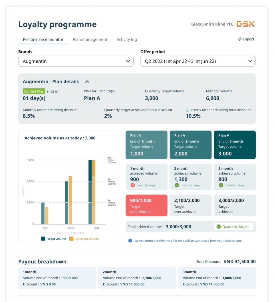
Loyalty programmes

Reward customers for ordering through eZRx.

Calculation Matrix UI/UX and stakeholdersFlow journey

I led the UI/UX and stakeholder alignment for the eZRx loyalty programme.

Monthly and quoatrly calculation of orders and encoragment with FOMO

Graph represenation of targets

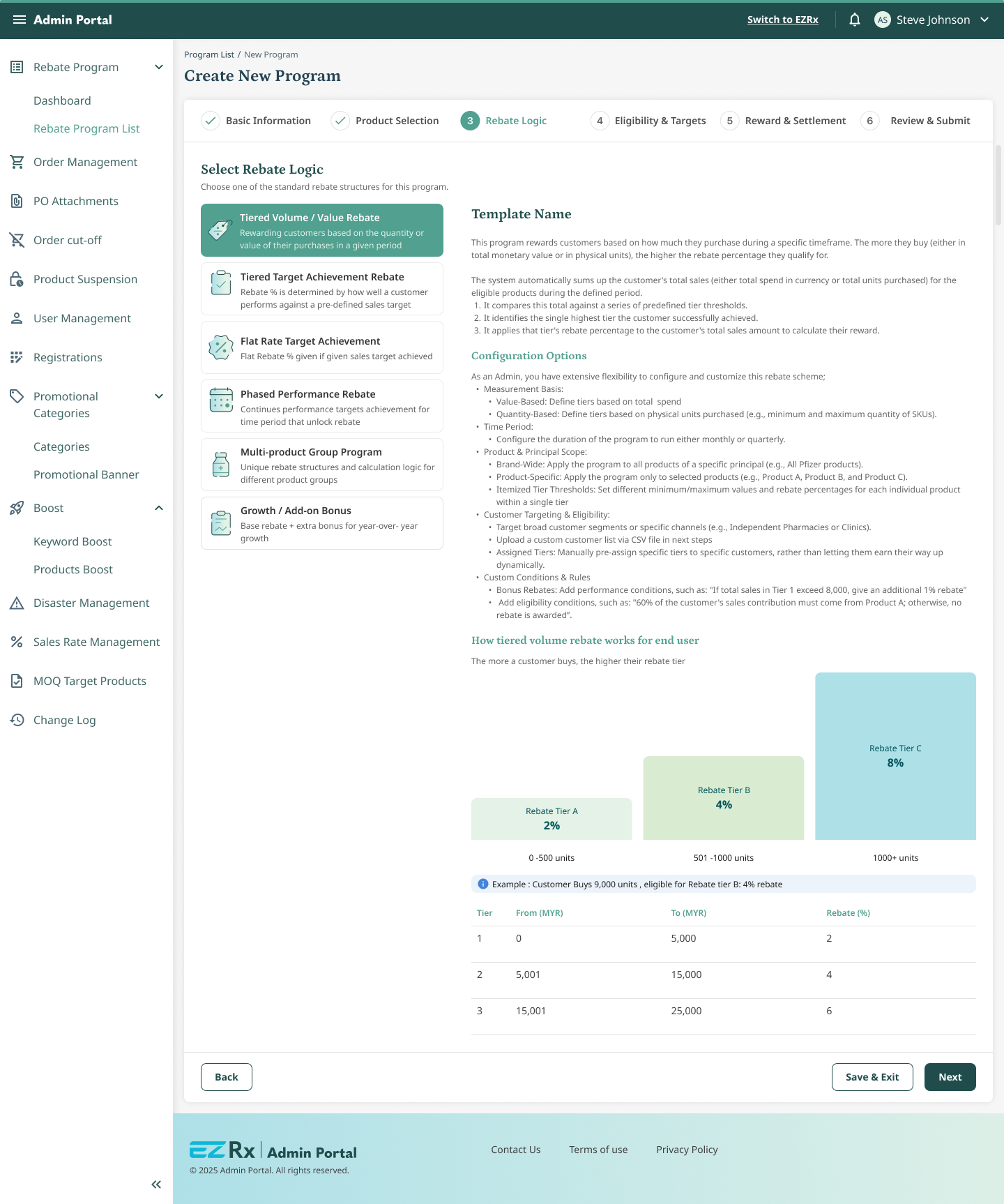
Combo promotions & Rebate programmes

Make bundle and multi-product deals easy to find and apply.

RebatesPromotionsMatrix

Promotions moved into one place in eZRx Plus, grouped by type so buyers can browse deals the same way they browse products.

Rebate program for user adoption with brand targets achivement.

Rebate program configuration matrix and end user flow jounrey alignments and reviews

Design system

One core system behind 15+ products

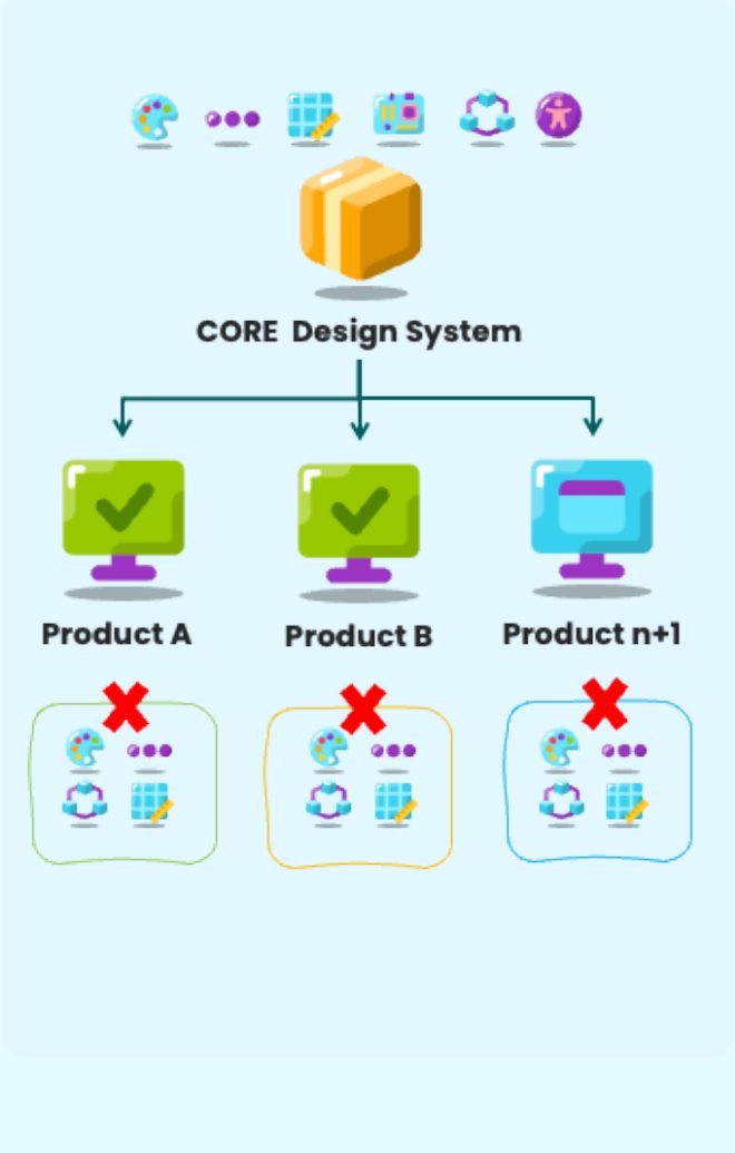
eZRx wasn’t alone. Zuellig’s other products each carried their own library, and every one of them drifted. Consistency across eleven markets was impossible while the foundations were split 23 ways.

23→1 design libraries consolidated into one core system
Diagram: one core design system feeding Product A, Product B and Product n+1, replacing separate per-product systems
Central foundations replace per-product systems.
7.2k
Components audited
−25%
Components removed in phase 1
15+
Products on the core system

I favoured boolean properties over sprawling variants, so one component could flex instead of being copied. Governance kept it that way: component naming rules, Figma branch management, review of every task before sprint sign-off and a monthly audit of the library.

The result is one brand across all Zuellig products, built-in multi-language support, and AA accessibility as the floor, working toward AAA.

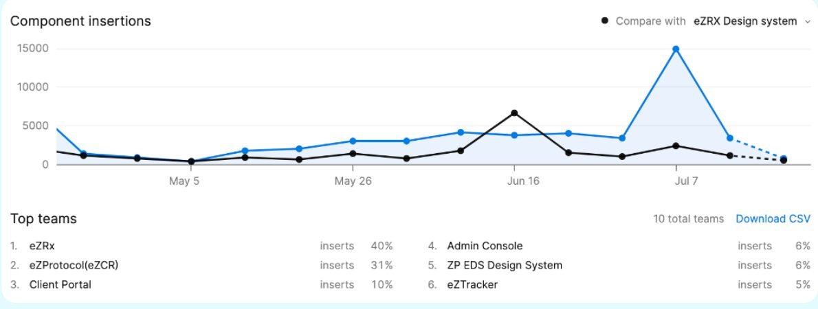
Figma analytics chart of component insertions by team, led by eZRx
Component insertions across teams after consolidation.

Outcomes

What changed,
2021 to 2026

24→69%
Customer adoption of the digital channel, past the 60% target
100→700M
Average sales order value per month through eZRx
−36→46
Net Promoter Score

Customer adoption

% of customers ordering digitally

Sales order value per month

Average, millions

Net Promoter Score

Customers, regional

Experience score by market

Scale of 1–7. Six is our threshold; below it signals ambivalence and an opportunity to improve.

Above thresholdAt thresholdBelow threshold ▾

The regional score isn’t uniformly green, and that’s the point of measuring it. Taiwan, Vietnam and Cambodia sit below threshold on overall experience, which now sets the next round of market-specific work.

Beyond core commerce

The role grew from designing the product to running parts of it

eZRx product design lead

Led 5 in-house designers and a 6-person agency team in Vietnam through eZRx 4.0 research, payments, returns and loyalty.

Principal product designer

Led up to 14 designers across in-house and agency through eZRx Plus, regional standardisation and the design system, later running leaner with 5.

Principal product designer and senior product manager

Took on product management for analytics, omnichannel engagement and three adjacent products, while still reviewing UX delivered by fixed-scope vendors.

Analytics

  • Mixpanel dashboard architecture for 11 markets
  • Data-quality governance and issue triage
  • Executive reporting
  • Training for every market

Engagement

  • CleverTap omnichannel campaigns for 11 market brand teams
  • Veeva CRM and Workato automation
  • Feature requests prioritised against yearly budgets
  • 100+ users trained

Adjacent products

  • eZTender and eZFlow enhancements, BRDs and PRDs
  • EZ Engage product support
  • 8 Sitecore brand sites with GA4, including a regional obesity-care brand

Proofs of concept with AI and automation

Remember the finance team that wouldn’t log in? These POCs take the product to where work already happens: inboxes, delivery routes and credit desks.

Bulk purchase orders placed automatically from email.
AI-assisted credit checks for order release.
Delivery route optimisation for the fleet.
A client portal suite for principals (eZ Approval, eZ PO, inbound shipment tracking).

What I’d carry into any platform

Diagnose before you design

Pairing NPS comments with a focused survey showed that the real problems were speed and missing clinical information, not visual design.

Validate small, then scale

Two pilot markets and a twelve-week POC de-risked an eleven-market rollout.

Configure, don’t rebuild

Regional blueprints, 21 standard statuses and one design system let each market flex without forking the product.

Let behaviour settle arguments

Pairing what users said in testing with what Mixpanel showed turned opinions into decisions.

Samath by samath4me
Scroll